Although there are many more choices out there, in this article, I’m going to concentrate only on Carrd themes available on the Carrd official site.
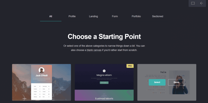
As of now, Carrd offers 245 fully responsive and customizable themes. Some of them are free to use, while others are only available with a Pro subscription, meaning with the higher-tier pricing plans. However, Carrd is known to be highly affordable, so “higher-tier” in this case means $19/year for the Pro Standard plan or $49/year for the Pro Plus plan.
The themes are categorized into five different categories: profile, landing, form, portfolio, and sectioned.
The profile and portfolio themes are great for building a personal website that you use to showcase your projects, skills, and achievements. They are great in a professional context, but you can use them in other scenarios too.
The landing and form templates are designed with e-commerce in mind, and they can be used for capturing leads, collecting emails, calling visitors to action, and so on.
The sectioned themes are especially interesting. Despite Carrd being all about creating single-page sites, the sectioned designs simulate multiple-page websites – but more on that later.
Here, we’ll explore the ten best Carrd themes and templates. We’ll pick two from each category, one Pro and one free. In cases where the category consists of only Pro or only free themes, then we’ll have to go with two of the same kind.
Just one caveat before we continue. Throughout this whole article, the terms “template” and “theme” will be used interchangeably. So, don’t get confused if I start talking about templates but end up saying something about themes.
That said, let’s finally begin the exploration of the ten best Carrd themes (aka templates).
Profile
There are 39 profile themes, and only four of them are Pro templates. These are our favorite two choices of the profile themes.
1. Carrd Template #75 (Pro)
This is an alluring, elegant, and loosely speaking, artistic theme. It allows you to use a prominent image in the background, and it includes a fade-in animation.
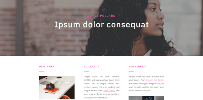
The theme is basically split into two big containers. The lower container is divided into columns that contain text and small images. The contact info and social media icons are located under the columns.
Of course, you can modify the theme by changing the layout, adding more elements, and tinkering with the pre-built design. However, since the person who created the theme is a professional web designer, it already looks pretty good. So if you don’t have much experience in this area, there’s no need to overdo it with modifications.
2. Carrd Template #6 (Free)
This one is very simple and to the point. It has the potential to express a lot in a condensed form. It’s clean, tidy, and clear. The icons are big and easily noticeable, just like the text, and two-thirds of the screen is allocated to an imposing image that adds some variety to the design.

In addition to this, because of the simple design, it’s easy to customize while still keeping its clean look. It would make a great profile site, if you ask me.
Landing
Carrd offers 23 themes for creating landing pages, ten of which are free.
3. Carrd Template #73 (Pro)
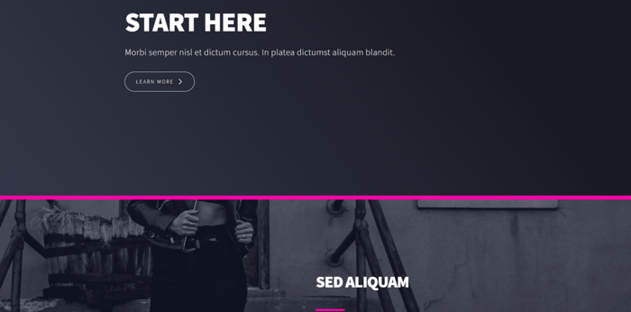
Simply put, the Pro landing templates have a great design. This is especially true for #73, as it radiates aesthetics and is uber-artistic. This makes it a great candidate for a site that has to do with visual arts, especially photography.
This is part of the template:
And this is another part:
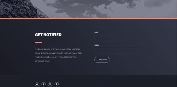
The layout consists of multiple sections, with the last one being a “thank you” section that shows up as a separate page (but it’s not). Additionally, the background images change as you scroll, which is an awesome effect.
Alongside the aesthetic excellence, this theme is also practical. It can provide the perfect amount of information about whatever it is that you sell without amounting to overkill. All in all, it’s an amazing landing page template.
4. Carrd Template #53 (Free)
This template has a lot of potential. At first glance, it’s pretty simple and sparse, but the darkened-out image in the background gives it some depth and prevents it from looking too bare.
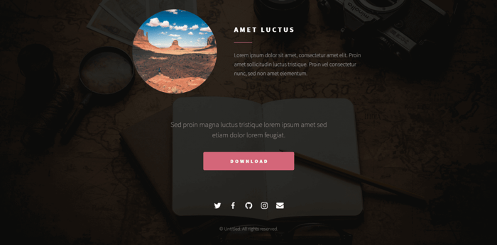
I don’t particularly like the paragraph font, but it’s far from a deal-breaker as it’s still legible. What I do like, though, is how the elements are positioned. Even though it’s a pretty straightforward template, it still looks dynamic because of the rounded image frame.
All things considered, I think it’s a great theme with the potential of becoming even better with a simple tweak of the font style.
Form
There are about 15 form templates, and not one of them is free. This means that both templates we’ll explore here are only available with the Pro plans.
5. Carrd Template #61 (Pro)
This one-page template consists of three different sections that show up as different pages with the same design. This is what you see first:
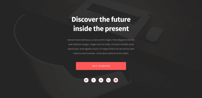
If you click on the “Get Started” button, it leads you to the actual form:
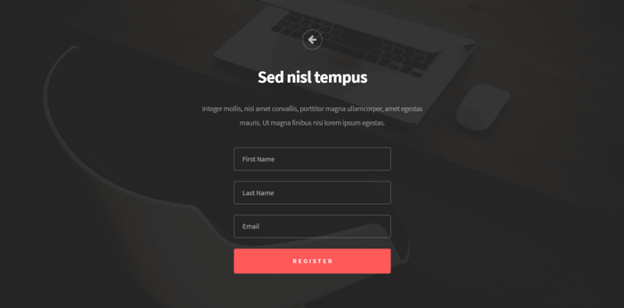
If you decide to register, you’ll see a thank you section/page, as is common with these types of pages.
I like the design. It’s simultaneously minimal, stylish, powerful, and practical, and the best thing is that it’s consistent. Essentially, these are all the things a theme whose centerpiece is a registration form should be.
6. Carrd Template #86 (Pro)
Structurally, this template is similar to the previous one – your typical landing page design, but this one is quite refreshing, and I like the font size.
It’s made up of three different sections that act as three different pages. This is the beginning section:

This is the second section, after which you see a “thank you” page:
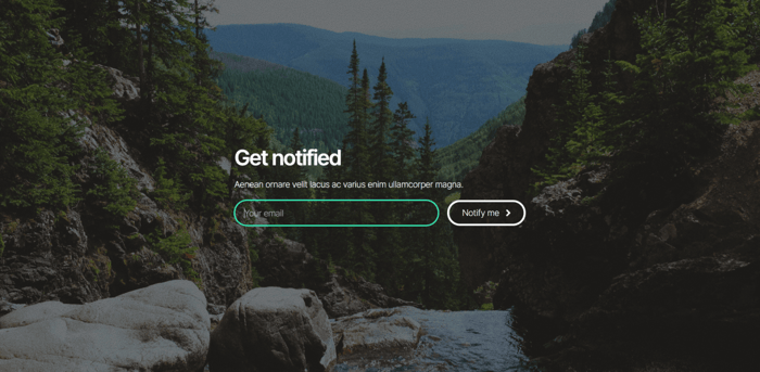
This theme is also characterized by minimalistic and practical design. As the previous two images show, this doesn’t prevent it from looking beautiful and appealing, and the biggest reason behind this is the beautiful image in the background.
Portfolio
There are only six portfolio templates. In contrast to the previous category, they’re all free. These are best suited for displaying artistic work of any genre.
7. Carrd Template #35 (Free)
This is a great template for creating a photography portfolio because it gives you a lot of room to showcase your art.
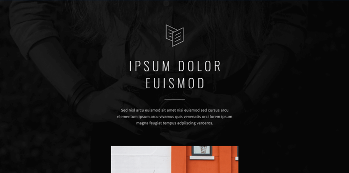
The audience can see the gallery by scrolling down until they reach the part with the social media icons so that they can get in touch with the author of the photos.
You can zoom in on an image by clicking on it, after which you can navigate through the gallery by clicking on the left or right arrows.

Of course, this theme would work well for showcasing virtually any other type of artwork too. Maybe with slight modifications, but it’s great for creatives and their unique works.
8. Carrd Template #68 (Free)
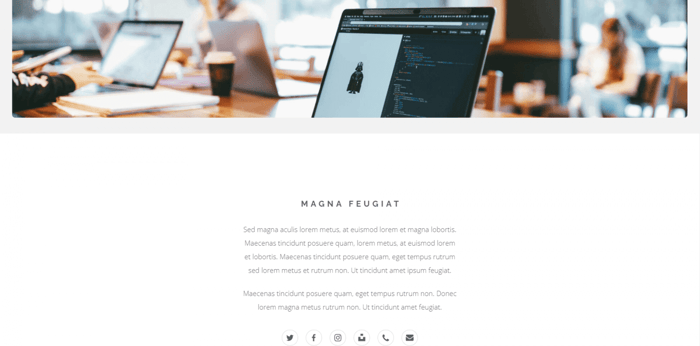
This template looks very simple, but it has the potential to turn into a beast. At its very center is a gallery that occupies the bulk of the space, so you’ll have more than enough room to show the world your art.
There’s a button that enables the visitors to go straight to the gallery. If they want to have a better look at the images, they can zoom in and navigate through enlarged pictures of your works.
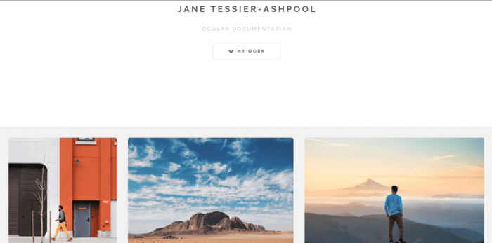
If you’re more into darker colors like I am, you can always change the background color or use an image, a video, a gradient, or even a slideshow as a background.
The template allocates space especially for text, so you can use this opportunity and write something about yourself, your art, and your professional experience.
It would’ve been a great theme anyway, but the fact that it’s free and available to anyone makes it even better.
Sectioned
Carrd offers eight sectioned templates in total, three of which are Pro and five are free. We already saw some examples of themes that fall within other categories but share characteristics with the sectioned templates.
For instance, when we talked about a “thank you” quasi-page, that was an example of how a sectioned design can function like a multi-page website.
So, how is this possible? Actually, it’s quite a simple trick.
Let’s say that a particular template consists of a few sections. There are buttons somewhere on the page, usually in the footer, whose number corresponds to the number of sections. When clicked, they each lead to a different section.
The users see only one section at a time while the rest are hidden. This creates the impression of moving from one separate page to another. Pretty straightforward and pretty cool.
Another perk of this type of design is that it’s especially suitable for adding a blogging option. Carrd doesn’t offer blogging functionality, so the only way to do blogging is through integrating third-party software.
The platform allows for embed codes, available with the Pro plans, which opens up a bunch of possibilities, like adding a blog to Carrd. The way to do it properly is to go with DropInBlog, an up-to-the-minute blogging platform that makes embedding a blog into your site easy as pie.
Okay, now let’s take a look at two of the best Carrd sectioned templates.
9. Carrd Template #55 (Pro)
This theme consists of four sections, “thank you” being one of them. But, you’re not limited to this number – naturally, Carrd lets you add more. That’s how you can add a blog, by creating a new section and dedicating it exclusively to your blog posts.
This is what your audience sees first when they visit your website:
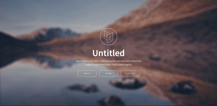
When they click the contact button, they see another section:
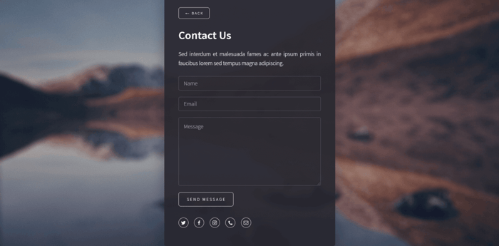
It’s as if they left the home page and were transferred to the contact page. It doesn’t matter where you are – when you click the “Back” button, you will always return to the home section.
This particular template looks nice, clean, and well-ordered. Really, it’s the exact opposite of crowded. It has a simple structure, which makes it easy to customize. Based on the way it’s designed, it seems that it could easily find its place in an e-commerce context, particularly in a small business setting.
10. Carrd Template #32 (Free)
I have to admit: this is one of my favorite Carrd templates. Definitely my favorite among the free Carrd templates. Let’s have a look at the home section:
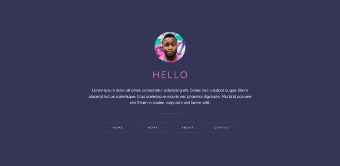
Cool, isn’t it? I like the colors and the font and how beautiful and potent the template is in its simplicity. Unlike the previous theme, this one is more artistic and good for showcasing a lovely gallery, for instance.

You can experiment with animations and mouse-on effects or different colors and fonts that match your branding. However, if you are going to change most of the pre-built design, then maybe it’s better to start from a blank canvas and build a site that matches your exact needs and specifications.
Carrd automatically optimizes the appearance of the page elements to make them suitable for phones. In fact, you can see what your site will look like on your phone by clicking “Switch to Mobile View.” However, you’ll notice that with some templates, the appearance of your site won’t be that great, so you may need to intervene and make some more adjustments yourself.
The way to do this is by switching the Carrd builder to “Mobile View” and modifying the elements whose appearance is problematic. Just click on the element, then click “Appearance,” and locate the “Mobile” toggle at the bottom of the panel.
Next, switch the toggle to “Manual” and make any adjustments you like using the additional customization settings. And you’re done! Please note that those of the settings with a value set to “Auto” will be optimized by default.
FAQs
How to use a Carrd template on my website?
Using a Carrd template on your website is really a piece of cake. All you need to do is click “Choose a Starting Point,” and you’ll be taken to Carrd’s templates. From here, choose your favorite template and click “Select.” And don’t worry, the platform was built to be quite intuitive, so even if you’re not tech-savvy, you’ll find your way.
If you’d like to start from scratch and create something specific, you can also choose a blank canvas.
Can I copy someone’s Carrd template?
You can’t exactly copy someone else’s Carrd template, but you can share a custom template created by someone else if they grant you access to it. Carrd allows sharing custom templates, but only on the Pro Lite plan or higher.
In a nutshell, if you want to share a template with a friend, you need to grant them permission by using their Carrd email. Your friend can then find the template under the “Shared” category. The process is pretty simple, but you can find all the steps in this Carrd Documentation article.
How can I make my Carrd template look better on a phone?
Carrd automatically optimizes the appearance of the page elements to make them suitable for phones. In fact, you can see what your site will look like on your phone by clicking “Switch to Mobile View.” However, you’ll notice that with some templates, the appearance of your site won’t be that great, so you may need to intervene and make some more adjustments yourself.
The way to do this is by switching the Carrd builder to “Mobile View” and modifying the elements whose appearance is problematic. Just click on the element, then click “Appearance,” and locate the “Mobile” toggle at the bottom of the panel.
Next, switch the toggle to “Manual” and make any adjustments you like using the additional customization settings. And you’re done! Please note that those of the settings with a value set to “Auto” will be optimized by default.
Over and Out
This was our selection of the 10 best Carrd themes and templates. Hope you liked it, and if you’d like to read more about Carrd, you can check out our Carrd review.
Choosing the right template for your site or page is not an easy thing to do. It can be a time-consuming and overwhelming process. I hope that this article lessens your burden a little and helps in your search for the perfect theme. Keep exploring Carrd, and never stop learning.

