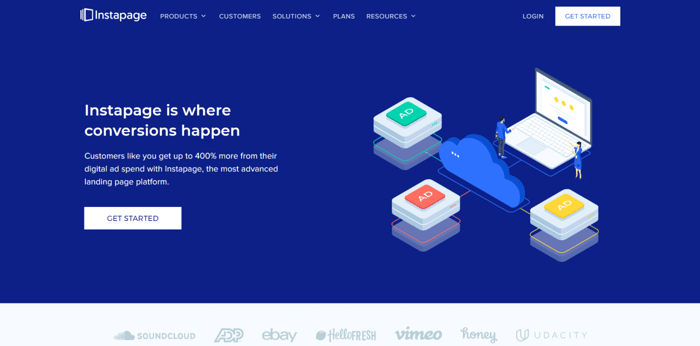
Instapage is a web platform that gives you all the tools for building elegant, high-converting landing pages. Not websites, not e-commerce stores – nothing else but landing pages.
This level of specialization usually results in high-quality products. Almost a decade of dedicated work (the company was launched in 2012) in a single niche means high technical know-how and virtually guarantees reliable service.
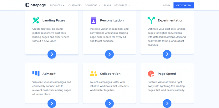
Landing pages should be simple, yet it takes a lot to create a top-notch landing page. They need a certain aesthetic appeal, so a good design is certainly one of the key ingredients of a superb landing page.
Considering how important the design can be, in this review, we’ll look at some of the best Instapage templates. So, without further ado, let’s explore the best Instapage templates.
Table of Contents
- Instapage Templates Overview
- Template 1: App Download
- Template 2: Asset Download
- Template 3: Business Service Inquiry
- Template 4: Case Study
- Template 5: Competitor Comparison
- Template 6: Daily Deals
- Template 7: Demo Request
- Template 8: E-Course Registration
- Template 9: Enrollment Application
- Template 10: Event Registration
- Template 11: Informational
- Template 12: Product Launch
- Template 13: Product Overview
- Template 14: Product Sales
- Template 15: Schedule Appointment
- Template 16: Special Promotion
- Template 17: Thank You
- Template 18: Travel Booking
- Template 19: Trial Signup
- Template 20: Up-sell or Bonus
- Template 21: Waitlist Signup
- Template 22: Webinar Registration
- Over and Out
Instapage Templates Overview
As you may know, a template is a design blueprint. It provides you with a starting point so you won’t have to start from scratch, thus saving you precious time. Normally, it follows the best contemporary design practices and comes with the necessary functionality to set you up for success right off the bat.
This may sound counterintuitive, but one of the best things about templates is that they’re not necessarily a finished product. The fact that they can be customized, both aesthetically and functionally, makes them a no-brainer for the majority of users.
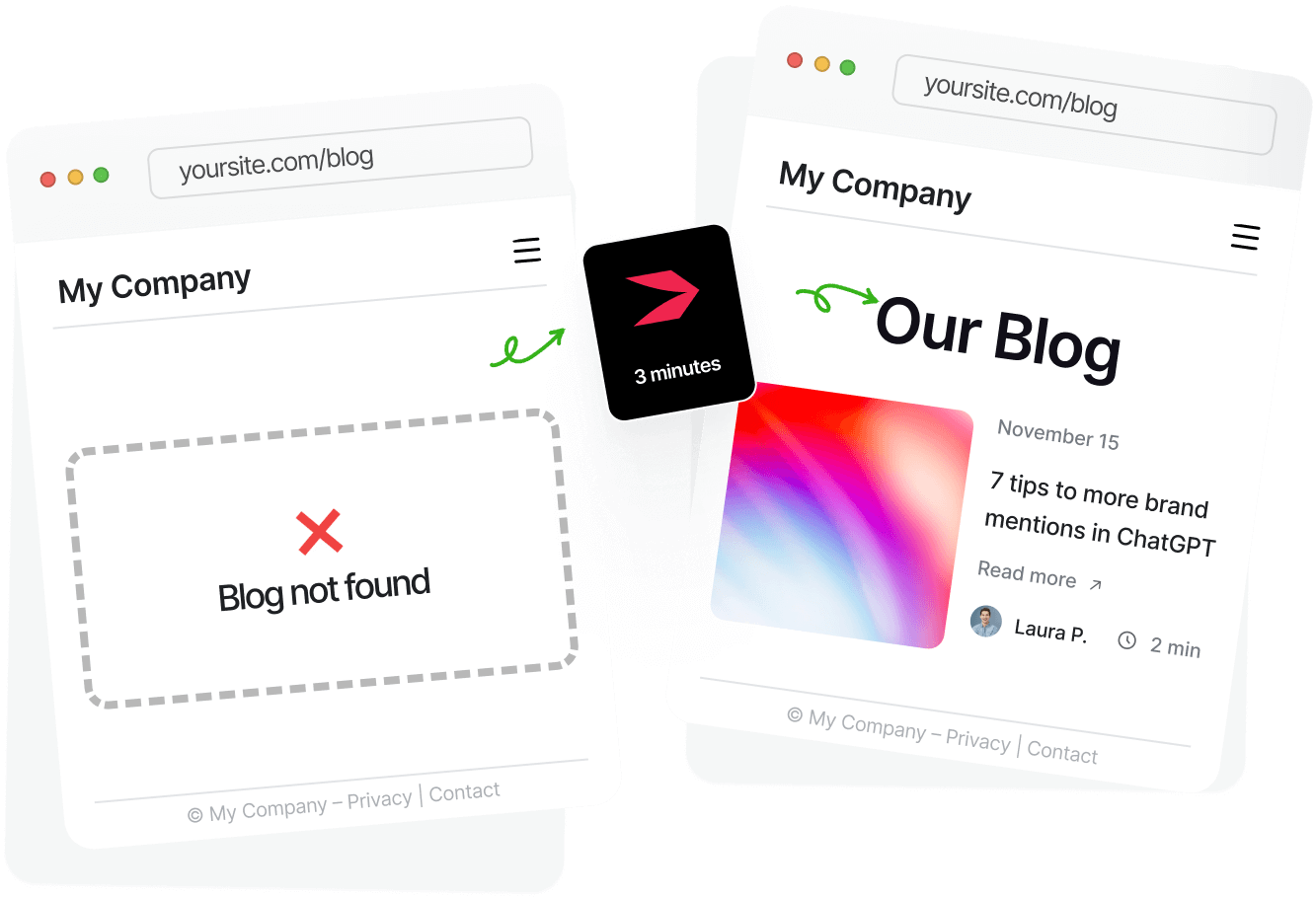
Templates give you a huge head start. On the one hand, you already have the essentials you need to get you started; on the other hand, you can customize your landing page and extend the range of functionality via different integrations. For instance, if you want to add a blog, Instapage allows you to do that. You can head over to DropInBlog, an awesome blogging platform, and create a blog on Instapage in no time. It’s that simple.
Regarding our topic, though, Instapage offers a lot. All of the templates are customizable and optimized for conversion. They fall within 22 categories, according to their use:
- App download
- Asset download
- Business service inquiry
- Case study
- Competitor comparison
- Daily deals
- Demo requests
- E-course registration
- Enrollment application
- Event registration
- Informational
- Product launch
- Product overview
- Product sales
- Schedule appointment
- Special promotion
- Thank you
- Travel booking
- Travel signup
- Up-sell or bonus
- Waitlist signup
- Webinar registration
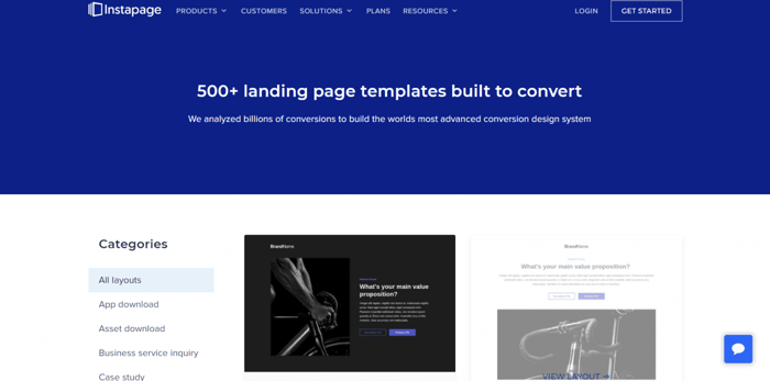
You can preview any template before you select it, so you can see how your page would look.
Going slightly back, there was a reason why we mentioned every single template category by name above. It’s because we plan to single out the best template in each category, which amounts to the best 22 Instapage templates. So, regardless of your niche, you’re sure to find a template that fits the bill for you. Let’s check them all out.
Template 1: App Download
There are 7 templates in the app download category. It was tough to decide between App Download Landing Page 4 and App Download Landing Page 7, but in the end, we chose App Download Landing Page 7.
Before we take a closer look at this particular template, we’ll say something about the naming convention we’re using here. Download Landing Page 7 is the name of the template as seen on the Instapage template page. When you access the templates from your Instapage admin dashboard, you won’t find this template under this name. However, it’s not very difficult to find it there as well. Given the way templates are currently ordered, it’s the seventh template.
There’s one caveat, though. Unfortunately, at times it looks like the template order is a bit jumbled. Nevertheless, this shouldn’t be such a big problem since none of the categories include many templates, which makes it easy to compare and find the exact templates we’re exploring here.
Now, getting back to the main topic, this is how the desktop version of the template looks, or at least a part of it:
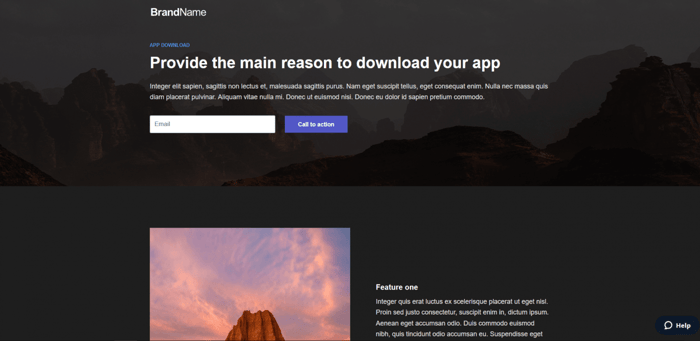
It has a great dark design and looks very elegant. There’s a CTA button in two different places, space where you can include images, space for some info on the main features of your app, and a place for a motivational message that’s in line with your brand.
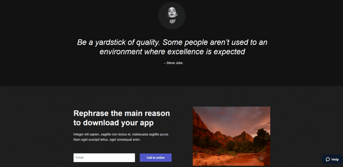
This template also includes space for one more image at the bottom, which is the place where you can “rephrase the main reason” why users should download your product.
Template 2: Asset Download
This category consists of 6 templates. From this group, we recommend the Asset Download Landing Page 1.
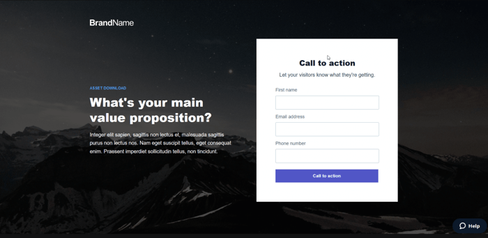
It’s a very beautiful template, slightly more complex than the others in this category but still simple enough to serve as the basis for building a great landing page.
Overall, it’s better when landing pages are simpler since their role is to provide key information about a product or service in simple terms and call users to action. This is definitely best accomplished if there’s nothing overly distracting on the page. Also, this is one of the key differences between a website home page and a landing page.
Despite including more elements, the Asset Download Landing Page 1 is far from having any distracting parts. It’s so elegantly designed that it looks like every part is in the right place.
Speaking of which, this template includes:
- A section where you can say a few words about the most notable features of the product you’re selling.
- A section where you summarize “how your product works.”
- A testimonial section that includes a video.
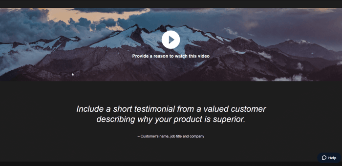
- And at the very bottom of the template, a section where you reinforce the main value proposition.
All in all, it’s a fantastic looking template that provides you with plenty of opportunities (for a landing page) to describe your product and inform your audience about the goods you offer.
Template 3: Business Service Inquiry
This category includes only 4 templates. In our opinion, the best one is the Business Service Inquiry Landing Page 4.
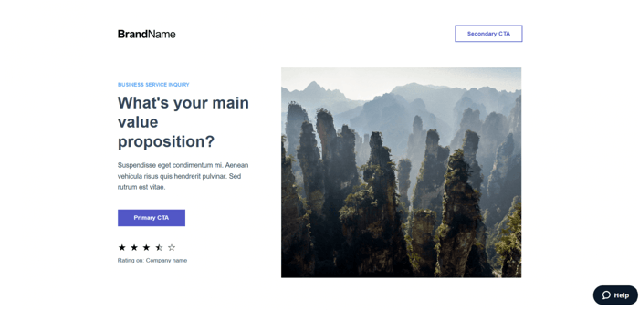
One of the things that we like the most is that you can cite your company’s rating if the source is credible. This adds to the trustworthiness of your brand significantly.
In addition to this, the Business Service Inquiry Landing Page 4 includes the following sections:
- Benefits (where you explain what users get by choosing your product)
- Image gallery
- Video
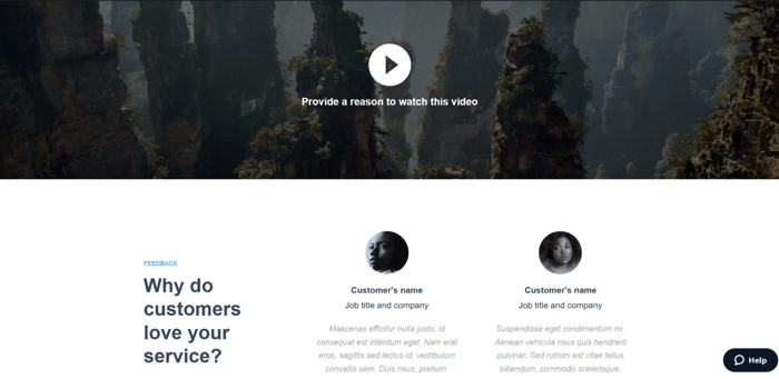
- Testimonials
- Short form
This template is rich in features, but at the same time, its designers managed to keep it simple. As far as landing page templates are concerned, this is definitely a winning combination.
Template 4: Case Study
There are only 4 templates in this category as well and we think that the Case Study Landing Page 2 is the best one.
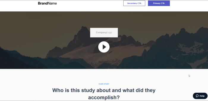
This is an excellent template in terms of informative potential. There’s room to explain so much about your case study, without the threat of losing the simplicity of your landing page.
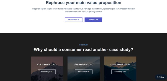
The Case Study Landing Page 2 template allows you to present multiple aspects of your case study in a summarized form. You can:
- Describe the strategy used in the study.
- Cite a short customer testimonial.
- Say something about the purpose, practical consequences, and target audience of your case study.
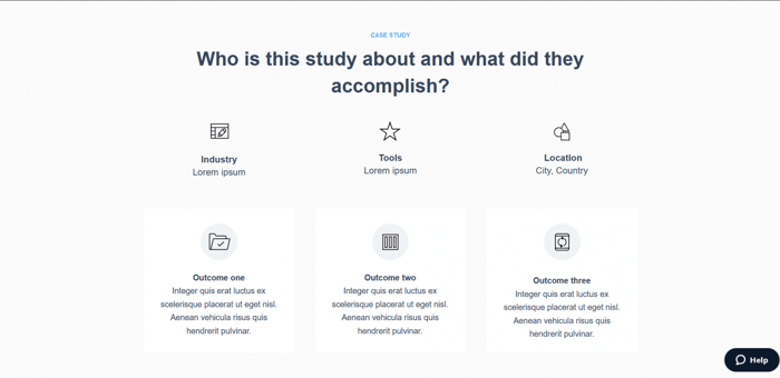
- Repeat your main value proposition in different words.
- Explain why users should care about the case study and the products you offer.
Template 5: Competitor Comparison
In this category, Instapage offers 5 templates. The one that we recommend is the Competitor Comparison 4.
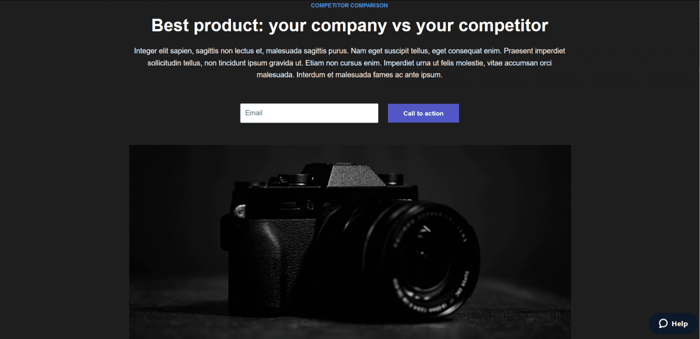
This is a beautiful and elegant template that has exactly the right number of features. It’s neither too simple nor over the top.
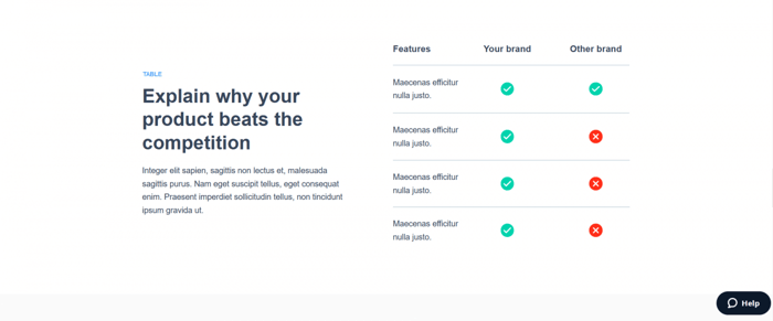
The Competitor Comparison 4 template includes:
- A benefits section (where you can talk about the advantages of your product).
- A comparison table for your product and your competitor’s product.
- A brief testimonial of a satisfied customer.
- A trusted-by section, which contains the names of brands/companies that use your product.
- A rephrased main value proposition at the bottom of the page.
Template 6: Daily Deals
There are 4 Daily Deals templates. The best one is the Daily Deals Landing Page 4.
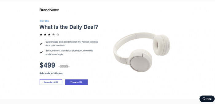
This template contains:
- A benefits section that includes images and text.
- Testimonials.
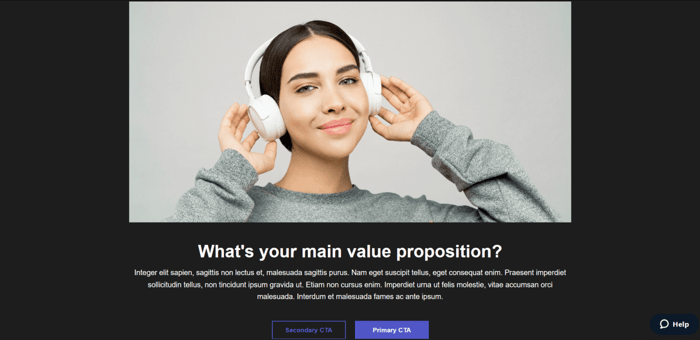
- A section with a rephrased main value proposition that includes a large image.
- A similar items section.
Template 7: Demo Request
The Demo Request category consists of only 2 templates. The Demo Request Landing Page 1 is a bit more complex, but it’s the one that we recommend.
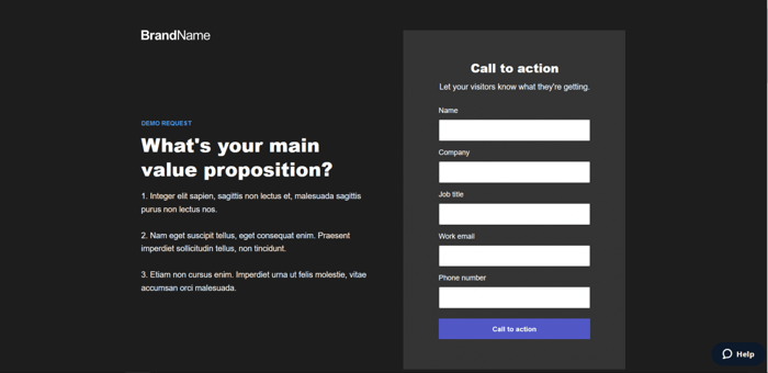
This template comes with the following features:
- A form.
- A features section.
- A section where you can explain in short how your product functions.
- A short testimonial.
- A trusted-by section.
- Your rephrased main value proposition at the bottom of the page.
Template 8: E-Course Registration
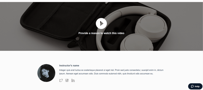
Out of the 4 templates from this group, we can single out the E-Course Registration Landing Page 1 template. It’s rich in features and it looks amazing.
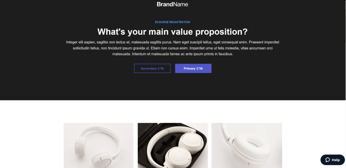
With course section descriptions, a video, a short bio section, social media buttons, testimonials, and even more, it’s excellent for attracting more students to your e-course.
Template 9: Enrollment Application
There are 5 templates in this category and they all look good. However, nothing matches the Enrollment Application 4. It’s an amazing template that can make for a highly informative enrollment application page.
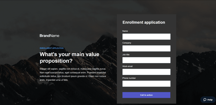
In addition to what you can see in the picture above, this template comes with:
- Two benefits sections.
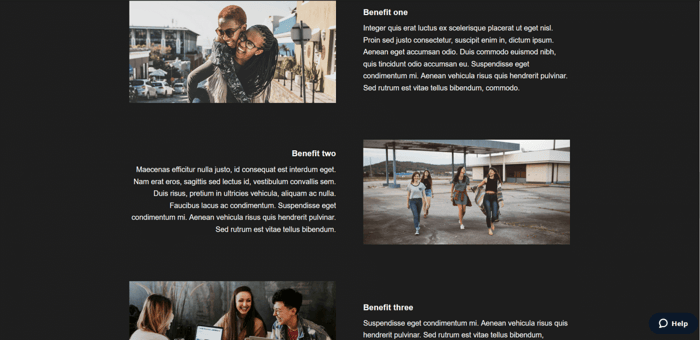
- A “more details” section, where you can describe multiple features of your program.
- A CTA at the bottom of the page.
Template 10: Event Registration
This category consists of 6 templates. The best one is the Event Registration Landing Page 1 template.
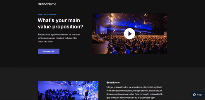
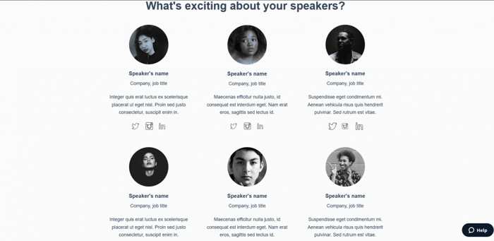
It’s a refined, dark-colored template that has multiple sections and provides a lot of room for presenting the upcoming event in the best possible light. With a separate speakers section, event timeline section, and a video, it gives you the tools to introduce the page visitor to all the necessary information about the event and persuade them that they should attend.
Template 11: Informational
As its name clearly says, the objective of this category is to share key information about your product. All 4 templates are structured like an article and are very simple. The one that stands out the most is the Article 4 template.
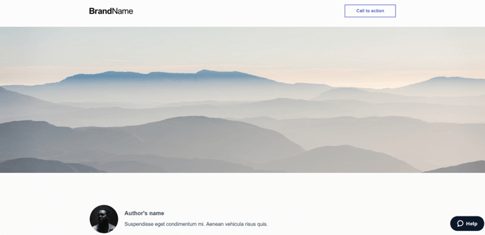
This template includes a section for a short article where you can provide the most important information about your product. There’s a part reserved for a customer testimonial and another CTA at the bottom of the page. Along with the CTA, there’s room for short text whose purpose is to reinforce the main point of the article and state the reason why users should be interested in what you offer.
Template 12: Product Launch
There are 4 templates in this group, too. The one that sticks out the most is the Product Launch Landing Page 2 template.
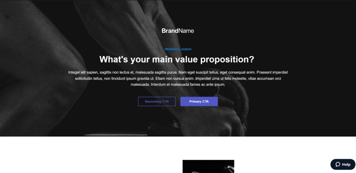
The biggest advantage of this template is its faultless aesthetics. It’s one of the most refined Instapage templates, but it’s also rich in features.
The Product Launch Landing Page 2 template includes:
- A cool features section with an image gallery
- A large video section
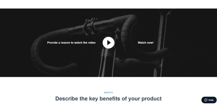
- A benefits section that also includes images
- A CTA with a rephrased main value proposition
Template 13: Product Overview
Out of the 4 templates in this category, Product Overview 1 is the most impressive. It’s pure elegance accompanied by rich features.
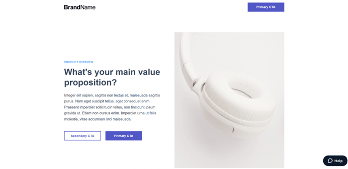
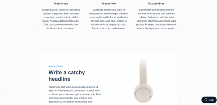
The Product Overview 1 template allows you to cite the reasons that separate your product from the competition, describe it in multiple ways, upload multiple images of it, add a testimonial, say a few words about its most important features, and more.
Template 14: Product Sales
This category is one of the widest; it includes 9 templates. The best one is the Product Sales Landing Page 5. It’s an extremely appealing template with just the right number of images and sections.
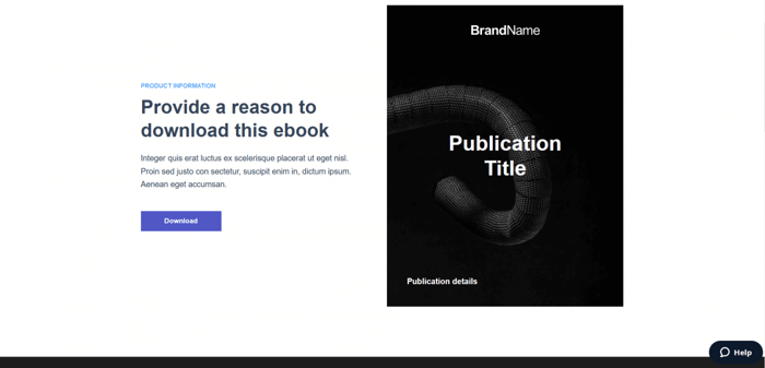
From what it looks like out of the box, it seems like it was designed primarily for e-book sales. However, this doesn’t mean that it should be used exclusively for selling e-books. You can customize it to make it suitable for selling other types of products as well.
These are some of the features of this beautiful template:
- A features section with an image gallery.
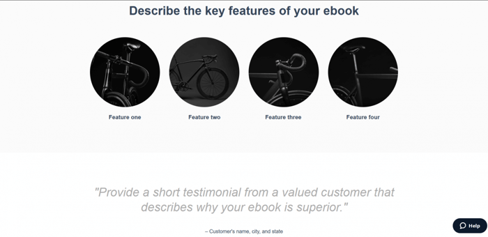
- A short testimonial.
- And a section where you can cite multiple reasons that your product is special.
Template 15: Schedule Appointment
Like many of the previous categories, this one also consists of 4 templates. The Schedule Appointment Landing Page 2 is the one that has the best aesthetics and features.
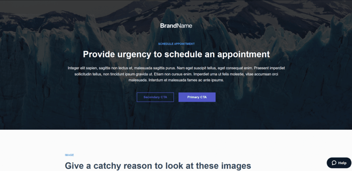
This is the section where the images go:

In addition to these features, the Schedule Appointment Landing Page 2 template allows you to add customer reviews and testimonials, add the names of notable companies that already put their trust in your brand, explain what makes your product/service special, and restate your main value proposition at the bottom of your landing page.
Template 16: Special Promotion
The Special Promotion category contains the same number of templates as the previous one. Out of the four available templates, the best is the Special Promotion Landing Page 3 template. It’s straightforward and it has a vast potential to be super-informative.
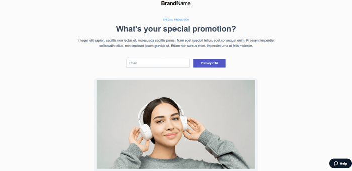
The Special Promotion Landing Page 3 template includes the following sections:
- Benefits
- Explanation of how the promotion works
- Satisfied customer reviews
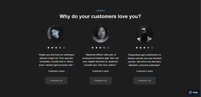
- Notable brands/companies that are your customers
- Your reiterated main value proposition
Template 17: Thank You
Instapage offers 7 Thank You templates. Due to their nature, they’re very simple and look quite alike. If we had to choose only one template from this category, that would be the Thank You Landing Page 6. This is how it looks in its entirety:

The background image is an excellent design feature. The short text is more than enough to show appreciation and gratitude to users who care about your product. An unobtrusive CTA button is here as well in case you want to do a promotion.
Template 18: Travel Booking
There are 4 beautiful templates in this category. The best is titled simply Travel Booking Landing Page.
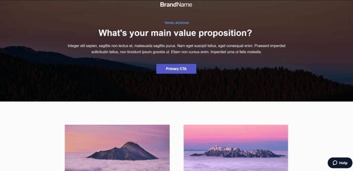
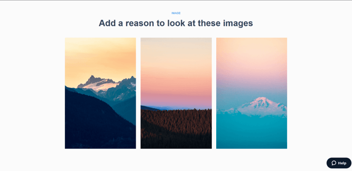
This template reserves a lot of space for images, which is natural considering that it’s a travel booking template. In addition to this, there’s a features section, space for a short testimonial, and an additional CTA section at the bottom of the page.
Template 19: Trial Signup
With 10 templates, Trial Signup is the most prolific Instapage template category. It’s not that easy to choose from these 10 options since they all fare pretty well in terms of aesthetics and features. However, one that attracts the most attention is the Trial Signup Landing Page 4 template.
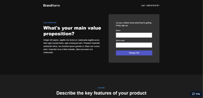
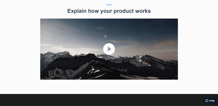
This awesome template includes the following sections:
- Features
- Showcase (a product description section)
- Multi-step explanation of how your product works
- Video
- Feedback (reviews and testimonials)
- Restated CTA
Template 20: Up-sell or Bonus
There are four templates in the Up-sell or Bonus category. Although it wasn’t easy to decide between Up-sell or Bonus 1 and Up-sell or Bonus Landing Page 3, in the end we chose the Up-sell or Bonus 1 template. It may be a bit overcrowded for a landing page template, but sometimes that’s the trade-off for being highly informative.
This is what you see first on the template:
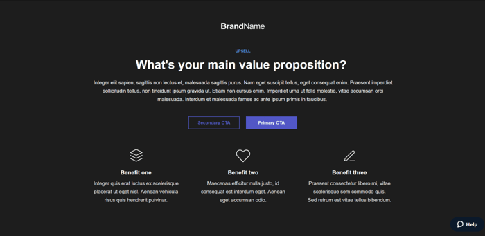
This amount of information can be a lot to take in, but with clear and appropriate wording, it shouldn’t be such a big problem.
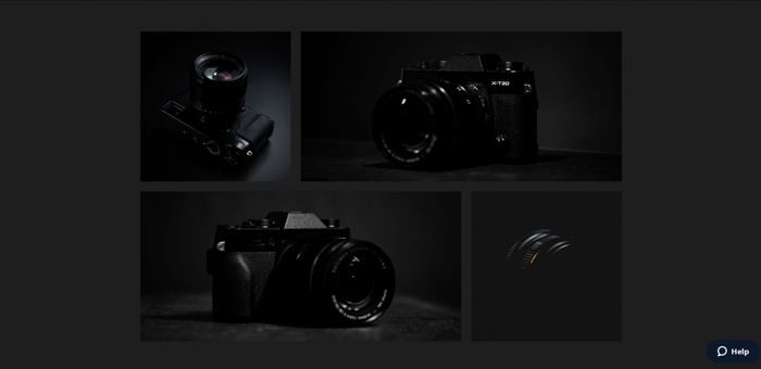
If you want to upsell your customers to more of your products, providing more relevant information on your product assortment can be crucial. With the pricing plans section, FAQ section, ability to upload multiple images, and the additional CTA section, you’re in a pretty good starting position to achieve this objective.
Template 21: Waitlist Signup
The next to last category includes seven templates. Most of them have a pretty simple structure and design. The one that we recommend is the Waitlist 1 template. It’s simple and to the point, but it doesn’t let simplicity compromise aesthetics.
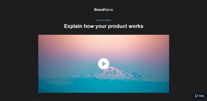
The Waitlist 1 template includes the following features:
- A video whose purpose is to explain the way your product works.
- A main value proposition/CTA section.
- A numbers and data section, which is a unique and interesting feature that can be very useful.
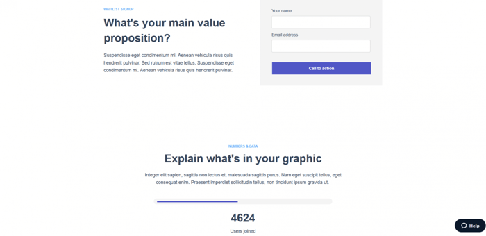
This template is extremely well equipped for building a solid waitlist signup landing page.
Template 22: Webinar Registration
The last category consists of nine templates. Other simpler templates are great as well, but here we recommend the Webinar Registration Landing Page 8.
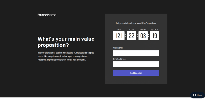
Apart from having a great design, it also has many features. The Webinar Registration Landing Page 8 template includes:
- A countdown timer.
- A section where you can explain how to register for your webinar.
- A features section.
- A speakers section that includes photos and short bios of the speakers along with social media icons to contact them.
- A webinar preview.

- Short testimonials.
- A restated CTA.
Over and Out
This was our list of the best Instapage templates. Instead of picking 5 or 10 templates and calling it a day, we decided to select a template from every category on Instapage. In the end, we got a list of 22 templates. This way, we can help anyone who’s looking for a recommendation regarding Instapage templates no matter the category. We hope you like the designs we selected.

