Choosing a template for your website, blog, or online store can be a fun experience, but it can also be daunting and downright stressful. If you created your website on Wix, finding that one template that perfectly represents your brand can be time-consuming considering there are over 900 Wix templates.
Wix can add to the pressure because once your site goes live, you’re stuck with the template you’ve picked … unless, of course, you delete everything and start all over again.
Either way, let’s go back and take it from the top – in this article, we’ve picked 40 fully functional Wix templates from their five categories. But before we get into that, let’s first run through some of the perks Wix has to offer.
Table of Contents
The Perks of Wix
Wix is a popular business software platform with solid website building and e-commerce functionalities. It can help you get started and establish your presence online, and it can grow as your online venture expands.
Wix is used by many because it offers a good set of features for affordable prices. It’s innovative, functional, and very customizable. The website builder has a drag-and-drop editor that allows you to freely customize any template to your liking without worrying about messing it up.
However, one of the best things about Wix is that it supports integrations with a variety of third-party and native apps to increase the functionality of your website or online store. This way, if you’re missing a feature or would like to replace an existing one, all you need to do is find the desired app on the Wix App Market, install it, and – voilà!
For example, many of the Wix templates we’ve linked below have an integrated Instagram feed, but some don’t, so you’ll have to add it manually if it fits the template. Similarly, if you’re running an online shop or a blog, you might want to integrate your Etsy feed to increase your reach.
The Wix App Market really has a ton of apps you can use, but our favorite one is DropInBlog. It’s a blogging tool that can be a great upgrade from Wix’s native blog if blogging is your main SEO strategy.
DropInBlog is super easy to integrate and fits into whatever template you choose seamlessly. If you’d like to try it, you can find it in the Wix marketplace.
And now, without further ado, let’s look at some of the best Wix templates from each category.
40 Best Wix Website Templates
Business and Service
Lynch & Powell
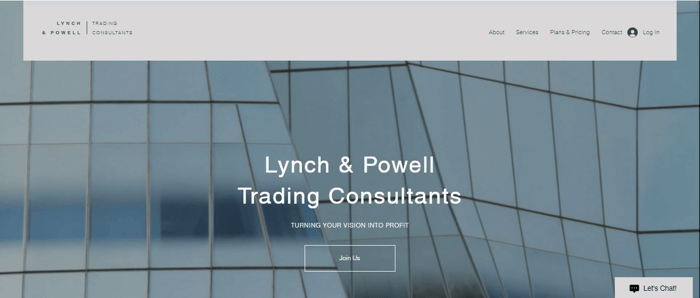
If you need a professional template that inspires confidence in your potential clients, Lynch & Powell could be the one. With its calm and neutral tones and expansive homepage, your site will look neat and organized.
We like that there’s a dedicated page for the pricing plans, and you can add separate pages for all the services you offer. Plus, customers have the option to create a profile and log in. One additional benefit is the live chat button on the bottom right and the contact form in the footer.
Allan Johnson

The Allan Johnson template is a bright and uplifting Wix template that serves its purpose really well – it’s joyous, inspiring, and very functional. The header menu is where customers can check out the types of services you offer, your pricing plans, and other helpful information.
Our favorite features are the blog, where you can post informative and educational content, and the “Guides” page, where you can upload files and control which users have access to it.
Crsn Bakery
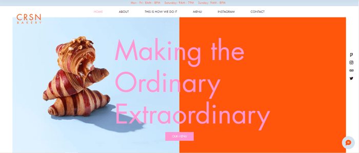
CRSN Bakery is perfect for dynamic cafés and coffee shops with a strong personality, if not even a little niche. The colors are vibrant and guaranteed to catch anyone’s attention and keep them for long enough while they’re scrolling through the menu. Alternatively, you can tone down the color palette to suit your brand.
This template is intended for food service businesses that have a physical location, as there’s a designated spot for the opening hours in the header and an interactive map at the footer. Tripadvisor and Foursquare are featured in the social buttons to the right so your guests can share their experiences.
Wright & Taylor
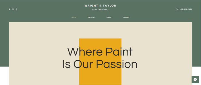
The design of the Wright & Taylor Wix template is as classy and sophisticated as they come. It’s modern and fresh, and we like that it’s straightforward. The header menu is at eye level and right in the center. Your business number is on the right, and your socials are to the left, making the most important information instantly available.
There is also enough room to integrate your Instagram feed and display images of your past projects as well as add some customer testimonials in the “About” section. The template translates well on mobile, so you can be sure that your website will be just as great on a smaller screen.
M&B Remodeling
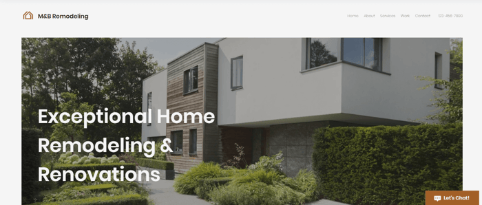
If you’re looking for a website template with a classic and timeless feel and a clean look, look no further. The M&B Remodeling template may be simple, but it looks very professional and includes all the features you need for a service business.
You can add separate pages to showcase each type of service you’re offering with neat and symmetrical layouts where you can add text and images.
Belle Weddings
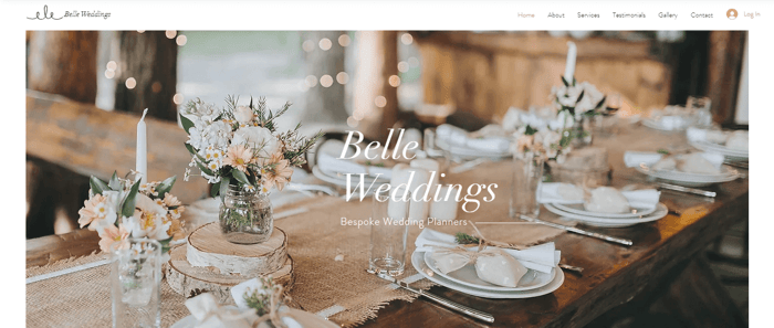
The Belle Weddings template is your standard wedding planner template where the images you upload are the main event. It’s a good-looking template that has all of the functionalities you might need from a website of this kind. There’s also a separate page for the services you provide.
Moreover, you can add customers’ testimonials, and there’s a photo gallery to display some of your past work. What we like here is that there’s the option to book a consultation found in the footer.
Vista.io

With its dark theme and serious vibe, Vista.io template will surely make your website stand out. The site is well-organized, and it looks highly professional. This template screams business – but more specifically, tech business.
The “Solutions” section features a large table where you can list all the services you offer, and what we like most about this feature is the animated text as you scroll down to read. The template also includes an integrated blog that fits perfectly.
The Pizza Shop
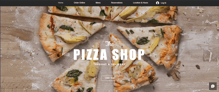
The Pizza Shop has a casual design that’s truly eye-catching. The heavy fonts and spacious sections make it not only good-looking but highly practical as well. In addition to the visuals, your customers will be easily able to browse through the menu and order online, make reservations, and even book the place for private events.
There’s also a social feed included, as well as an interactive map. It’s got everything a pizza shop or any other food service provider could want.
Bar 121

They could’ve named the template “Bar 101” since Bar 121 has literally all the basics a bar would need – an overview of the menu, the option to book a table, and the best feature is the weekly schedule overview.
So, you can include a calendar of events like daily happy hour or live gigs. It’s a no-fuss, no-frills design great for modern and lively bars that have an especially busy events schedule.
VIRTUFIT
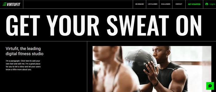
The VIRTUFIT template was designed for fitness businesses that offer online classes and virtual fitness programs. The template is stylish and easy to navigate, and we especially love the text animations, which make the site look very dynamic.
Feature-wise, this template offers everything you need – menus for live and on-demand classes, fitness challenges, and pricing plans. Our favorite part, though, is the Google Play and App Store buttons, which allow you to advertise and redirect customers to your app.
Finally, apart from Facebook and Instagram, the social media selection also includes TikTok to keep up with the latest social media trends.
Maya Nelson
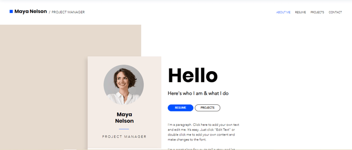
The Maya Nelson Wix template is designed for professionals seeking to build a portfolio website. It certainly does the job quite well. The design is clean, unobtrusive, and gets straight to the point.
Your photo is framed well, with links to all your relevant socials below it, including LinkedIn. The main menu includes pages for your full resume where you can upload a document of your CV and enable it for download and any past projects you’d like to add.
Store
MANIÈRE

Maniere is a visually stunning template for online shoe shops. The homepage features a big hero image, and right below that, you can add the product categories you want to highlight. This Wix template also has the Previous and Next buttons on individual product pages, so users can easily view the entire collection without switching tabs.
Much like many other templates on this list, Maniere has a chat widget at the bottom of the page, a search bar at the top left, and a stylized section where you can prominently display your newsletter signup form.
Fresh Market
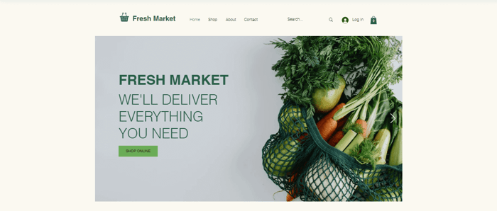
As its name would suggest, Fresh Market was created for online grocery stores. It has a simple and understated design, but it’s still very stylish and will win you over with its symmetrical and clean-looking sections. It makes you feel as if you’re wandering the aisles of your local grocery store.
There isn't any fanfare with its features, either – your customers can browse through the virtual aisles, search for a specific product, log in, and of course, shop. As with most Wix templates, there’s a live chat at the bottom right, as well as a section where you can add FAQs and your shipping and return policies.
EZ Electronics
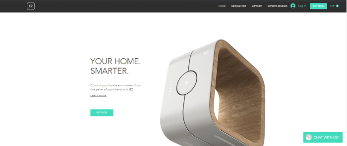
If you need a sleek and slightly futuristic-looking template for your online electronics store, then EZ Electronics may be for you. The template was designed in such a way that your product receives all the attention. You’ll have enough room to add the details of its features and how it works.
You can make the manual available for download on the “Support” page, where you can also add FAQs and a contact form. Our favorite part is the “Experts Reviews” section, which serves as a forum for all the users to interact with each other and ask questions.
MODA

MODA is a commercial and very lively-looking template that is best suited to large online stores with a lot of traffic and a lot of products. The template is colorful, and as with any fashion store, the images take center stage, but the layout itself is organized and clean, never overpowering.
This template features women’s, men’s, and beauty categories with subcategories, as well as a “Sale” category. At the footer of the page, you can add your sales policy, shipping and returns policy, customer care details, and social links.
Lou Paperie
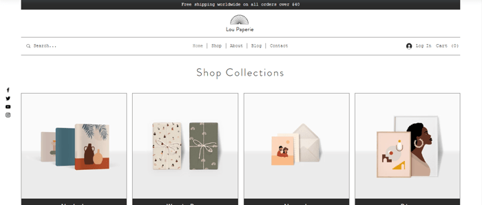
While we’re living in a largely digital world, stationery lovers certainly aren’t extinct. There are still those who appreciate the charm of putting pen to paper (and maybe adding some stickers). The Lou Paperie was designed with stationery enthusiasts in mind. It more than adequately showcases the charm and versatility of modern stationery with its simple design and typewriter-style font.
This template would work both for brick-and-mortar stores that sell online and for exclusively online shops. The social buttons are located in a small column to the left, while all the details of the store can be found at the bottom of the homepage.
Swirl
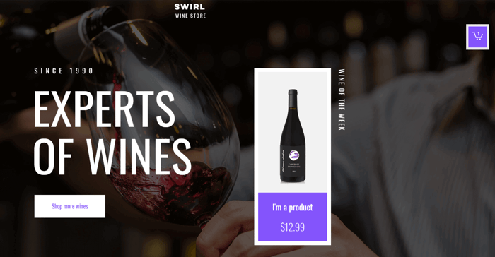
The Swirl template was designed to boost sales. The homepage features a big heading and a call-to-action that invites users to view all product collections. Another highlight of this template is that it lets you add one product along with the "Buy Now" button inside the hero image, so users can visit that product's page with a single click.
What we like about the Swirl template is that it has a slide-out shopping cart. Users can easily access it from each site page, which allows them to view the contents of their shopping cart at all times, and once ready, proceed to the checkout page.
Bloom’s Tea
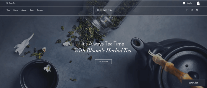
Tea making is an art form, and the Bloom’s Tea Wix template does well in capturing the beauty of tea. It has a calm and traditional feel to it, and it’s perfect for small businesses that sell carefully selected craft tea.
The navigation menu features a page for the products as well as for extra products such as tea infusers, pots, and cups. Lastly, there’s an integrated blog where you can discuss all things traditional tea-making and increase engagement on your site.
Sprout
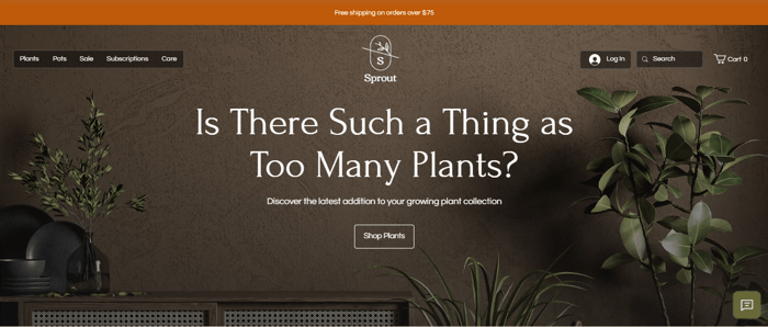
This beautiful Wix template will ensure your website stands out and presents the best of your store. Sprout has a very modern design with earthy, neutral tones and big, elegant fonts. Moreover, it’s just as functional as it is aesthetically pleasing.
At the top right, your customers can log in or search for a product, and at the top left, they can browse through the product categories or subscribe via the navigation menu. The “Care” page – which is essentially a blog – where you can post tips, instructions, or other educational content. We particularly like the addition of the blog to this template.
Lastly, there is an integrated Instagram feed so you can make the most of social media and show off your products to a variety of customers.
Besties
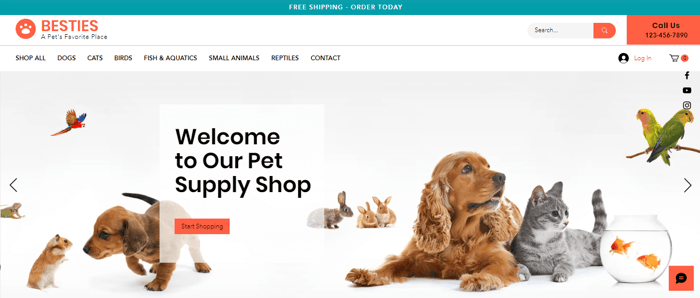
Besties is a joyful-looking pet supply store template that draws you right in with its bright design and colorful accents. It’s functional and not overwhelming with choice. Right from the get-go, you have the “Search” button at the top of the page, along with a designated place for your store phone number.
The main menu is divided into different categories for each type of pet, and at the footer of the homepage, there’s room for the rest of the info on your store, including FAQs and your store policy.
We particularly like the integrated chat function that your customers can make use of to get in contact promptly.
G’LORE
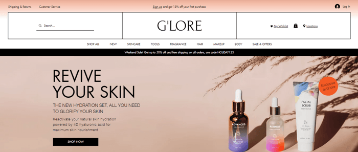
This colorful and eye-catching Wix template is perfect for high-volume businesses that sell different types of cosmetic products. The design of G’LORE is very reminiscent of a high-end beauty department store.
The navigation menu covers all the basics, while the header includes a “Search” button and a “Wishlist” page, which we really like. The homepage has categories for must-have products, new arrivals, products on sale, and personal recommendations to increase engagement. In the footer, there is a range of social media links – from Instagram to TikTok and Snapchat – to satisfy all your engagement needs.
Creative
Joe.JR
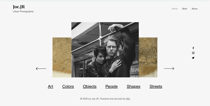
The Joe.JR template gives you a bold space to present your creative photography portfolio. You can present a selection of your best work on the homepage and develop collections in separate categories. An About page is available for you to list more detail on what inspires you professionally, as well as a brief outline of skills and certificates.
There’s plenty of white space between all the image sections, allowing each image to shine its own space. There are the essentials, like social sharing buttons, and, naturally, the template looks good on mobile as well.
Ella Stonehill
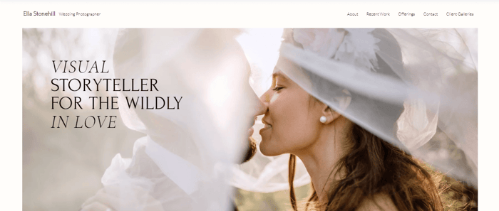
Wedding photography is an important part of a wedding, and the Ella Stonehill template will be sure to showcase your photographs in the most elegant way possible. The design is gentle, formal, and does a good job of keeping you engaged on the site to explore some more.
The main menu includes pages for select client galleries and recent work you’ve done, and of course, a pricing page for your services. There’s even an About section so your clients can connect with you.
Nespola Studio
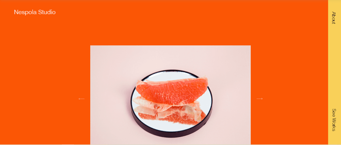
If you’re into bold designs, then you will love this Wix template. The layout of Nespola Studio is minimalistic, but the bright orange background and the sparsely placed colorful images make up for the lack of lines and sections and complement it perfectly.
Dynamic and forward-looking creative agencies may find it fits quite well within their brand philosophy. The navigation menu is just as minimalistic as the layout, with only “About” and “Our Works” pages.
Den
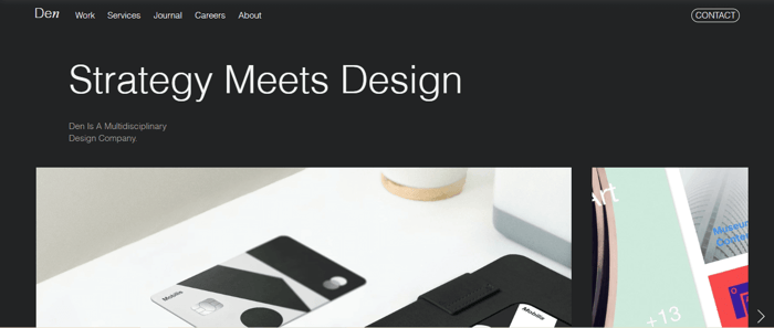
Den looks like it means business in a very sleek and stylish way. This Wix template is image-driven, and the charcoal gray background allows the content to pop. It was built for design studios that do different types of creative work.
The navigation menu features pages for past projects, services offered, news about where the studio is going next, and job application forms for specific positions. There’s also a Journal page that allows you to create a blog to build a relationship with your audience.
Dara Valasko
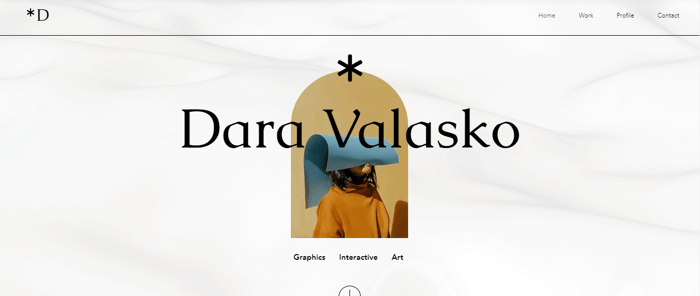
This Wix template is best suited for freelance graphic designers who collaborate with a lot of different brands and companies. Dara Valasko is a simple but very creatively made template with an animated background and a lot of room to display a portfolio snapshot of past projects.
On the “Profile” page, you can add the details of your experience, listing all your engagements and competencies.
The Pop Show
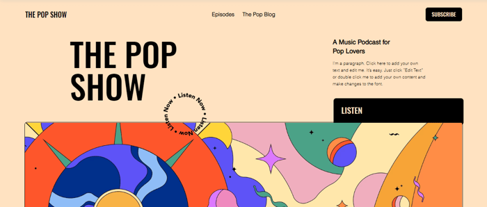
This vibrant and zany Wix template will surely brighten up your day, whether you’re a lover of pop art or not. The Pop Show has everything a contemporary music podcast needs and then some.
There’s a comprehensive episodes page, an eye-catching blog, a social media feed, a subscribe form, and – most importantly – links to Spotify, Apple Podcasts, Google, Podcasts, and Stitcher. It’s not overloaded with links and pages, so it hits the spot perfectly.
Urban Artist

The Urban Artist template has a very original design and a looped background that adds to its uniqueness. It features a gallery roll to display your work and lets the images speak for themselves.
The contact form and social media buttons are included in the footer, and there’s an About section to tell people a bit more about your artistic drive and passions. This template will let your work speak for itself with no frills.
Robert & Alan

Robert & Alan is one of the more visually oriented Wix templates, which makes it perfect for vlogs and any other image or video-driven business.
The first thing website visitors see is a big hero image with a clickable button that takes them down the homepage and to the video section. Meanwhile, the handy positioning of this button can be used to link to a site’s shop or any other page on the site.
This template is also a great fit for e-commerce websites as it has a page where you can display your store’s products. Some of its noteworthy e-commerce features include the quick-view feature and a slide-out shopping cart, which makes all products on your site easily accessible.
Sophia Romanos
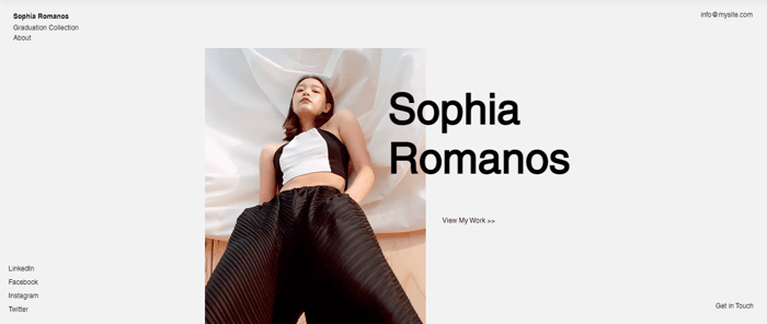
If you need a virtual space to display your fashion designs and connect with clients, the Sophia Romanos template might be a good fit. It’s especially ideal for a budding new designer trying to build a network and showcase their talent.
With its minimalistic layout and subdued colors, it’s designed to frame large images of your best work. The social media links are on the bottom left and are in the form of text instead of icons, which gives the template a bit of a classic vibe.
Community
Watch & Learn
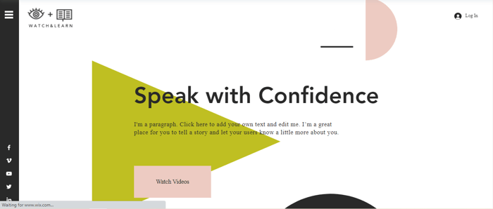
The charming Watch & Learn template is optimized for online classes and courses with a lot of video material. The hamburger menu on the left reveals dedicated pages for video courses, booking private sessions, and online courses.
The design features large fonts and pastel geometric shapes on a white background, giving it a contemporary look. The social media buttons are located to the left below the hamburger menu, and they include Vimeo and YouTube if you want to add some extra video resources. There’s also a pop-up chat function so customers can quickly get in touch.
Designtalk
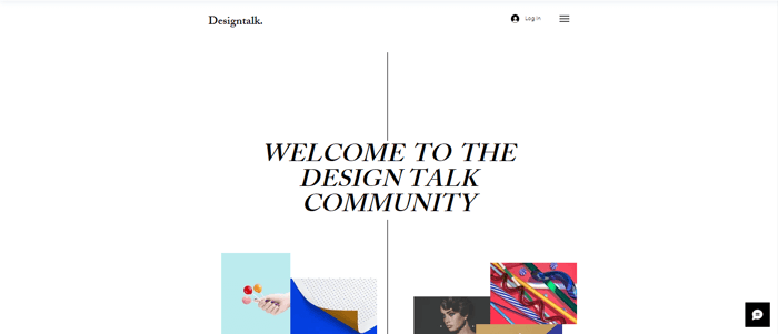
If you need a space where you can discuss, collaborate, and learn about design with other creatives, then you might like Designtalk. It’s equipped with a blog where you can post educational content and a forum where members can interact with each other and share ideas and experiences.
There’s also a contact form for collaborators and a subscription form for readers. This Wix template features a simple, unimposing design that’s still interesting enough to engage visitors because of the cluster of images in the middle.
Davon

With the Davon template, you can create a strong and professional-looking website for an online business school. The template’s design features geometric blocks of content, which make it comprehensive and easy to navigate.
Apart from the modules page, there’s an integrated blog where you can regularly upload countless learning resources. There’s also a section to introduce the educators involved and add a little detail about the school from its inception.
CRTVTY/CON
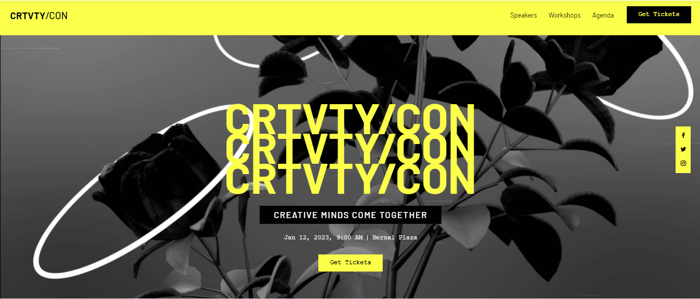
The CRTVTY/CON Web template is great for creative conferences not only because of its attractive design but also because it covers all the aspects of a conference very efficiently, which we like.
The header menu features a large “Get Tickets” button that visitors can’t miss. You can add all the essential details like speakers and guests, details about the workshops, and the agenda. The background section features a unique black-and-white glitch-style animation, which is quite an attention-grabbing addition.
50 Zones

As with any type of forum, gaming forums are lively virtual spaces, so having a well-designed template is imperative. 50 Zones comes through in exactly that regard, being as eye-catching as it is functional.
The homepage is quite minimalistic – it’s all about gaming. In the main menu on the top right, there are links to additional pages like the forum page and events page for meetups or other events. As with any forum, there is also a members page, which users can access only if they’re logged in.
Blog
Read Over

This quirky and modern Wix template is for all the bookworms out there who have finally decided to run their own book blog. The Read Over template is a combination of white space, large images, and bold text. The style of symmetrical boxes of content gives it a neat look, and the illustrations, particularly the animated ones, make it pleasantly vibrant.
You can navigate the site through the hamburger menu on the top right, and you can access the socials on the top left. There’s just enough to give the visitor all they need and draw them into your blog.
Going Places
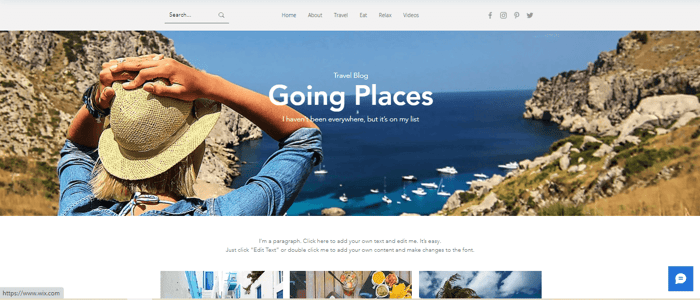
This travel blog template would make anyone eager to set off on their next adventure. Going Places relies heavily on images, which is usually the case for a travel blog, but you’ll have to make sure you have high-res images.
The “Search” button and socials are located in the header, along with the navigation menu, which features different categories of content, including videos. Naturally, it’s the page layout that draws the audience into the latest blog posts, only to then explore the travel categories further.
The template is simple and not crowded but quite functional, and it leaves a lot of room for the images of your trips to speak for themselves.
Turning Heads
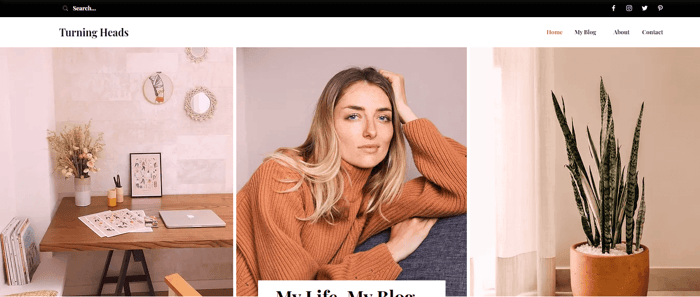
The Turning Heads Wix template is perfect for running a personal blog. The vibe of the template is friendly and cozy, and the combination of warm neutral tones against a white background give it a welcoming feel. This template features large images and a neatly laid-out blog feed that flows easily on the page.
The homepage is adorned with a subscription box and an Instagram feed below it to promote engagement. The other socials are located in the header, including Pinterest, if you want to share some more of your photos with your readers.
BellaO
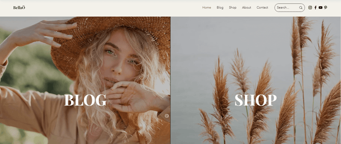
The BellaO template is one of the more functional Wix templates, and it’s perfect for influencers. Right from the get-go, you’re greeted with two full-screen images side by side, making the blog look like a fashion editorial.
The template is intuitive and easy to navigate – the blog itself looks very organized and takes center stage. There’s even a “Shop” page where you can add a selection of items you’ve worn or used for your readers to buy directly on the site.
Daily Routines
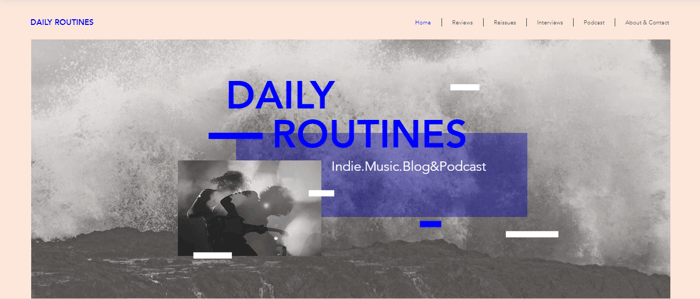
For those passionate about music, the Daily Routines template allows you to blog about your favorite bands and local gigs. The template has a really nice and original design – you could even say slightly offbeat.
You can label your posts and publish them into different categories, like reviews, new releases, etc. What we really like in this template is the ability to add your own podcast episodes, making the blog even more engaging and interactive. It also looks just as good on mobile, and it remains easy to view and navigate, which – as we know – is really important for busy people on the go.
FAQs
Do Wix templates cost extra to import and use?
The beauty of Wix is that there are hundreds of fully customizable templates available, all completely free.
Are Wix templates copyright free?
The templates and stock images provided by Wix are all copyright-free but only intended for use within the Wix platform.
Over and Out
Wix is a great platform, and it’s certainly not for nothing that it has been one of the most popular business software for years. Their selection of templates is impressive, and most of them seem pretty functional and mobile-responsive.
We hope that we have provided you with enough ideas in your hunt for the perfect Wix website template. Choose wisely – remember, you can’t change it once your site goes live.


